Mode Unlocks New Color Controls to Elevate your Visualizations
Christine Sotelo, Director of Product & Customer Marketing
January 7, 2024
NaN minute read

Mode took a huge leap forward with its color control features, providing users with a powerful toolkit for elevating their data visualization game.
Color customization
We understand the importance of color customization when creating visualizations. Mode has redefined the user experience by simplifying and streamlining the modification of colors. This not only saves time, but also introduces a level of intuitiveness that caters to users of all skill levels.
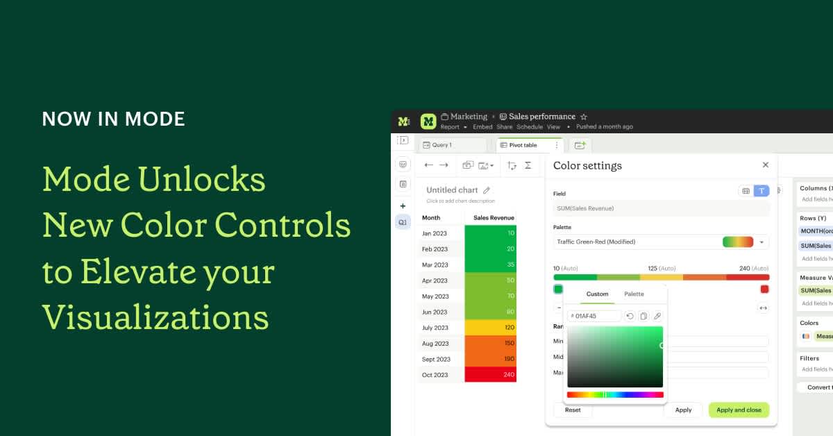
Our users now have the creative freedom to move beyond predefined color palettes. Whether it's using hex codes, a custom color picker, or selecting colors from palettes in their workspace, the possibilities are endless. Users can now choose colors that best suit their visualizations, resulting in more personalized and impactful data representations.
Learn more about color customization for Dimensions here and Measures here.
Expanded palette options
The new, expanded palette options in Mode offer increased flexibility and creative freedom, enabling users to customize visualizations according to specific data characteristics for more accurate representations. Mode supports categorical, sequential, and diverging palettes. Users can seamlessly create, save, and reuse these palettes in the Mode workspace to ensure consistency in branding across Reports.
Categorical palettes: Ideal for non-ordinal data like countries, companies, etc.
Sequential palettes: Continuous gradients that go from light to dark or the other way round. These are ideal for visualizing numbers that go from low to high, like income, temperature, age,etc.
Diverging palettes: Similar to sequential palettes – but instead of just going from light to dark, they have a bright middle color and then go darker to both ends of the scale in different hues. These are ideal to visualize negative and positive values.
Learn about palette options in Mode here
Reduced cognitive load to interpret visualizations
Reducing cognitive load is at the heart of our efforts to enhance interpretation of visualizations. Mode recently introduced neutral color assignment and stepped palettes to make visualizations more digestible and insights easily accessible.
Neutral color assignment:
Highlighting values of interest by assigning a neutral color to all other values serves as a cognitive aid, directing the viewer's attention to the values of interest only. This technique minimizes distractions, allowing users to focus on the most relevant aspects of the visualization. In Mode, users now have the ability to bulk assign a neutral color to multiple values and customize it according to their preferences.
Learn more about neutral color assignment here
Stepped palettes:
Stepped palettes play a pivotal role in reducing cognitive load by providing a segmented representation of data. By converting sequential and diverging palettes into stepped versions, distinct color blocks are created for different data intervals. This discretization simplifies data interpretation, making it easier for users to identify patterns, trends, or anomalies.
Learn more about stepped palettes here.
Precision in data representation
Users can now define meaningful thresholds or intervals that match their data's characteristics and highlight values of interest. For example, A sales manager might be interested in identifying regions with revenue in a specific range (e.g., $1 million to $5 million) to determine potential growth opportunities. With the ability to define these data boundaries, the manager can customize the color scale to highlight the regions falling within the target revenue range. This allows for better visibility and quick identification of the regions meeting or exceeding the sales targets.
Learn more about data boundary customization here.
Inclusive visualizations
Mode ensures inclusivity by supporting colorblind-friendly palettes by default, making data interpretation accessible to all users, regardless of visual abilities.
With these robust improvements to color control, Mode has simplified the creation of insightful visualizations. Stay tuned for more exciting enhancements to data visualizations in Mode.
Get our weekly data newsletter
Work-related distractions for data enthusiasts.


