Facebook's "Aha" Moment Was Simpler Than You Think

Benn Stancil, Co-founder & Chief Analytics Officer
January 30, 2015
NaN minute read

Many leading tech companies have promoted “aha moments”—the instant a user understands the value of their product—as a key to growth. Most notably, Chamath Palihapitiya declared Facebook's “aha moment”—getting to 7 friends in 10 days—as Facebook's North Star on the path to 1 billion users. Twitter, Dropbox, and Zynga have all emphasized the importance of similar simple metrics and Slack, the current poster child for rapid growth, recently shared theirs.
Like so many startups, we set out in search of our own “aha moment.” What we found was that “aha moments” are less about advanced analytics and more about simple math and strong messaging. Here's our recipe.
"7 Friends in 10 Days"—Simplicity, not Science
In his book Outliers, Malcolm Galdwell famously claimed that becoming an expert in a task requires 10,000 hours of practice. The claim provided a simple, quantifiable path to success.
Critics argued that this was misleading. They said Gladwell understated the importance of innate skill or intelligence. What takes a talented person 2,000 hours might take someone less talented 20,000. Gladwell's 10,000 hours isn't a magic threshold; it's a memorable average computed across a diverse set of people (and in Gladwell's case, across a small sample as well).
Like Gladwell's 10,000 hours, “aha moments” blend different experiences into a single number. As a result, they shouldn't be viewed as scientific tipping points; they're often round numbers picked in the middle of a range of possibilities. One Facebook user might kind of like Facebook after becoming friends with 4 people and 20 days; another might be addicted once they create 10 friendships in 2 hours.
But that's not a flaw—that's the point. Facebook's decision to define their “aha moment” in such simple terms suggests they weren't trying to optimize it to be precise as possible. Other “aha moments”— 30 follows, 1 file upload, 2,000 messages—follow the same pattern: they emphasize simplicity over science.
Why? Because “aha moments” aren't about precision, but about defining a core principle and a quotable rally cry for the entire company. According to Palihapitiya, Facebook “talked about nothing else;” 7 friends in 10 days was their “single sole focus.”
This focus can be hugely valuable—but only when tied to a metric that represents customer value. So how do you find that metric?
Make it About Retention
The “aha moment” is a misnomer. It's not a moment. It's a set of actions that separate customers who find value in your product from those who don't.
Customers who find value come back. If you identify which actions separate retained customers from lost ones, you'll know what drives customer value and you'll have your “aha moment.”
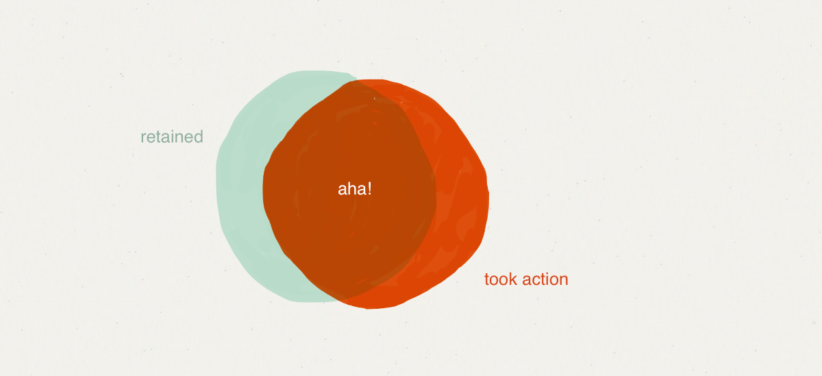
The venn diagrams below demonstrate what we're looking for—an action that's taken by most people who retain and isn't taken by most people who are lost. For example, consider an app that enables users to, among other things, send messages. Users who send, say, 8 messages usually retain, but most retained users didn't send 8 messages.

Users who send 1 message suffer from the opposite problem: nearly every retained user sent a message but so did many people who were lost.
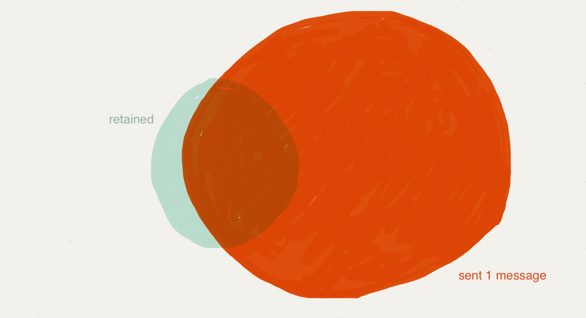
In an “aha moment” large portions of each circle overlap with the other.
Find What Drives Retention for Your Product
Start by picking some actions that you think might be important. They could be the number of messages users send, how many people they follow, the number times they log in, or anything else that might provide a signal that users like your product.
For each feature, see how retention rates change as usage changes. The chart below (which is based on sample data) shows a graph of retention rates by the number of messages people send in their first week as users. According to this data, 28.8% of users who send one or more messages retain, while users who send two retain 42.4% of the time. Users who send at least ten messages retain at a very high rate of 91.7%.
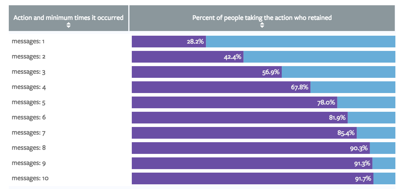
It's tempting to conclude that this product should push users to send around 8 messages. But referring back to the venn diagram, this only shows how many people in the orange “took action” circle are also in the teal “retained” circle. There could be lots of retained users who didn't send 8 messages.
The next chart, which shows the number of users sending messages, reveals exactly that problem: not many people are sending 8 messages.
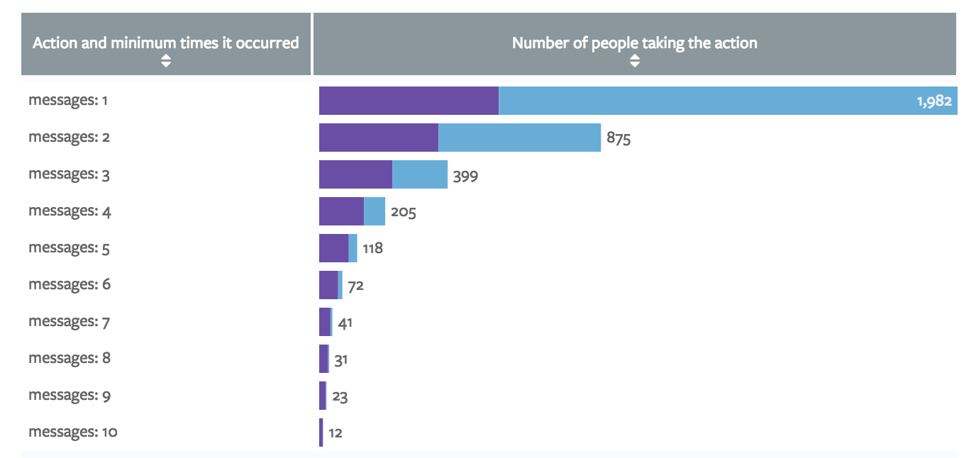
Importantly, the problem illustrated here isn't just a small sample size. For widely used products, the small bars in this chart would still represent hundreds of thousands of users, far more than is needed to reach “statistical significance.”
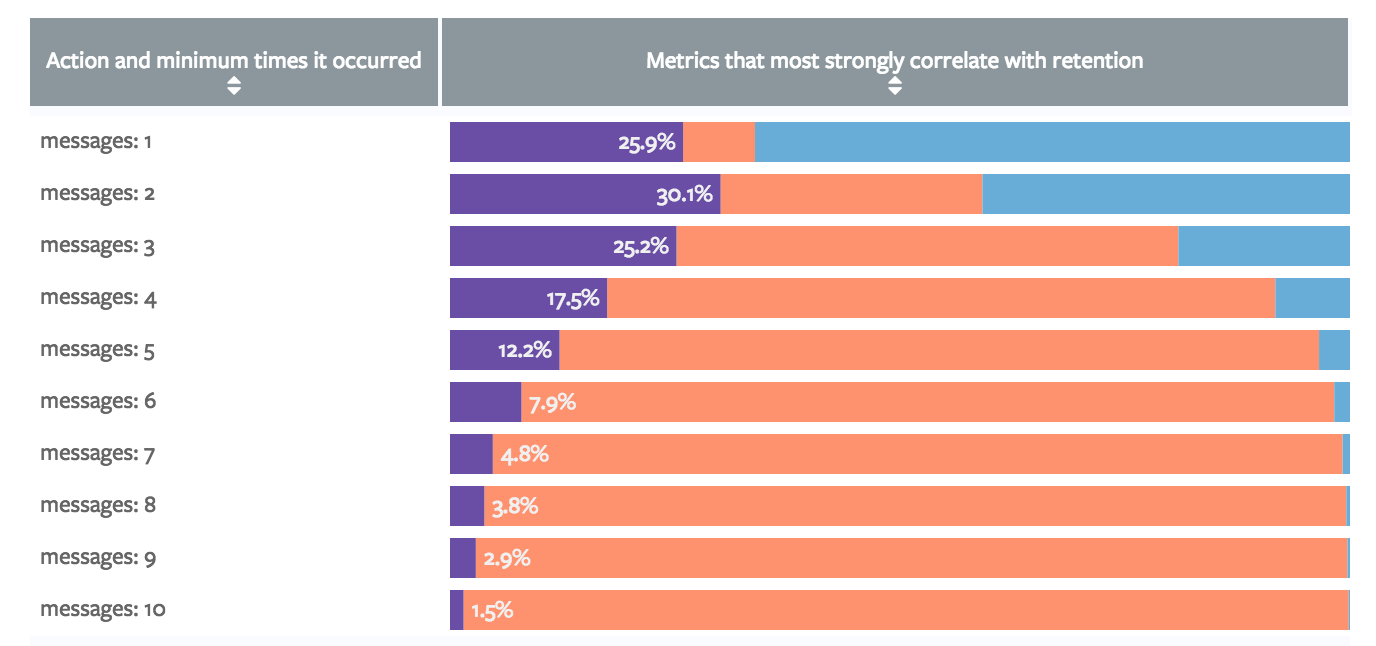
The bigger problem is that most people who retained didn't send 8 messages. The third chart below illustrates how many people are missed. As it clearly shows, far more users retained and didn't send 8 messages (the red bar) than those who retained and did send 8 messages (the purple bar).
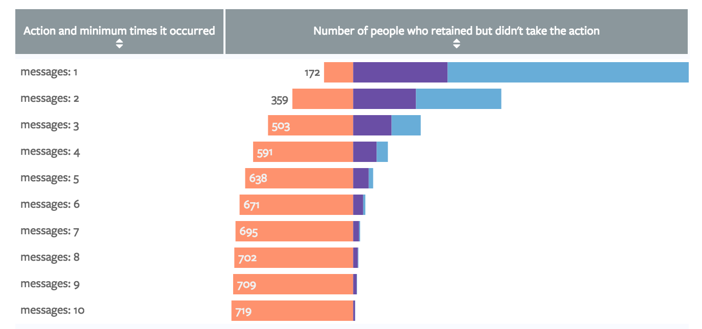
This final chart shows a stylized version of the venn diagrams. The larger the purple bar, the more overlap between the action and retention. The conclusion? Get users to send two messages.
Break Your Correlations
On the internet, it's obligatory to note that correlation doesn't imply causation. And yes, the analysis above identifies correlations.
But correlations are usually a good place to start. Once you find what correlates most strongly with retention, push users to take that action. If the relationship is causal, more people will retain and your correlation will hold. If it's not causal, people will take the action but won't retain at higher rates. As a result, the original correlations will break down until another feature emerges as being more strongly correlated with retention. Rinse and repeat until your correlation holds.
To understand how this works, imagine that analysts at Facebook discovered that sending two messages correlates strongly with retention. It's possible that sending two messages shows them great features in Facebook chat, which makes them hooked on the product. But it's also possible that people like Facebook for other reasons and they send messages because they're already using Facebook.
If Facebook wanted to test the idea that sending messages drives retention, they could put a big button on their homepage that said “CHAT WITH YOUR FRIENDS!” This would almost certainly increase the number of messages sent—and if messaging drove retention, retention would increase as well. If messaging was only correlated, however, it'd have very little effect on retention and the correlation would start to break down. Facebook could then check that idea off the list, and start to look at other features.
Once you find a correlation that doesn't break, make it memorable. “Aha moments” aren't about precision, but about ensuring that your product and your team never lose sight of core values.
Use Our Queries!
The four charts above come from analysis we did internally at Mode. As a part of our effort to open source our analysis, all of the work behind them is available for you to tailor to your product's data. The interactive version of the visualization below represents our analysis but is built with fake data (we can't open source our data).
This help document contains a detailed discussion of how to adapt it to your data. The report is built on a common data structure that should work for most companies. It only requires a users table, an events table, and a SQL database. If you have those tables, you simply need to define them within your query; the rest of the code should work without any additional modification.
Recommended articles
Get our weekly data newsletter
Work-related distractions for data enthusiasts.
