Point Nine Capital VC Christoph Janz often blogs about critical metrics for startups and SaaS businesses. Over the last year, Janz has written a number of posts about cohort analyses. Last October, he published a spreadsheet on Andrew Chen's blog to help businesses create their own dashboard.
Given the importance of [cohort analysis](https://mode.com/blog/cohort-analysis/) for many businesses, we've recreated the template in Mode. In just a few steps, you can create a living cohort analysis that anyone at your company can update any time—without exporting data to Excel. Simple instructions and tips for tailoring the analysis to your data are shown below the graphic, which was created using fake data to match Janz's spreadsheet.
How-to
- See the "Results a la Mode" link just under Table 6? Click it to open the analysis in another tab.
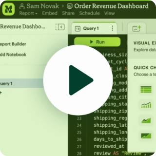
- Explore the "Query" or "Presentation" links to see how everything works—the report is generated with customizable HTML/CSS and Javascript that sits on top of a SQL query. We've written the query to be compatible with common data structures: you'll need a table with users and a log of the events you want to measure.
- Click "Clone" begin modifying the report.
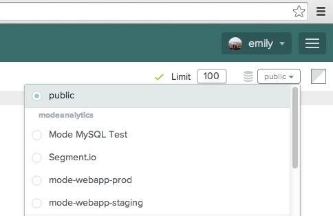
- In the upper right, you'll see a menu that says "public." Switch to your private data source. Note: If your database isn't hooked up to Mode yet, it's easy to get connected.

- Modify the query to refer to your data rather than the fake data. Follow the commented-out instructions to reference a users table in lines 33-35 and an events table in lines 47-49.

- Click "Run" and then click "Publish." Your cohort analysis is ready to share privately with anyone at your company. Whenever you need to check in on your cohorts, click "Refresh Results" to update the data.
Tailoring the analysis to your needs
If you're ready to dig deeper, you can add much more to this report. Because you control the SQL that generates the report, you can adapt the query to show specific events or add custom parameters. Parameters, which we'll explore in an upcoming blog post, enable folks who don't know SQL to modify the report without writing code. You can change any element of the visualization or add more charts to the dashboard by editing the HTML, CSS, and Javascript.
We should note that this example is designed for generic data structures. Because Mode is a series of modular blocks—the query, the results, and the visualization—you can modify each module without affecting the others. You can adapt this query to fit your data, as long as the output columns remain consistent with what this visualization is expecting. For large datasets, we recommend using pre-aggregated retention or engagement tables if you've got them. This can dramatically improve your report's performance.
If you need help or want to learn more about using Mode to find and share insights with colleagues, please don't hesitate to drop us a line at hi@modeanalytics.com.


