How to Make a Box-and-Whisker Plot in SQL

Benn Stancil, Co-founder & Chief Analytics Officer
October 1, 2015
NaN minute read
Understanding how your data is distributed is critical for any analysis. Box-and-whisker plots are great for summarizing distributions and comparing distributions across datasets. Here's how to create them in SQL.
Summarizing distributions with box plots
Datasets are often summarized with a single value, such as an average or median. While succinct and easy to understand, these “measures of central tendency”—such as the chart below showing the median ages of Olympic athletes—obscure the bigger picture.
Skeleton, the sport for people who've decided they've lived long enough.
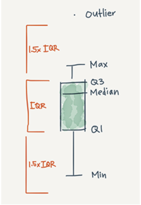
To better understand the shape of your data, box-and-whisker plots (or simply, box plots) quickly display other descriptors. Flowing Data's Nathan Yau does a great job of introducing box plots. As he notes, box plots typically graph six data points:
The lowest value, excluding outliers
The first quartile (this is the 25th percentile, or median of all the numbers below the median)
The median value (equivalent to the 50th percentile)
The third quartile (this is the 75th percentile, or median of all the numbers above the median)
The highest value, excluding outliers
Outliers
The visual output looks like this ("IQR" stands for interquartile range, and is the difference between Q1 and Q3. More on that in a bit.):
And when plotted by a computer rather than a human, you can begin to see how box plots are helpful for making comparisons across datasets:
These additions highlight many details the previous graph missed. While Skeleton athletes have the highest median age, curlers tend to skew older. Over half of the speedskaters are between the ages of 23 and 28. And despite being among the sports with younger athletes, alpine skiing includes the oldest athlete in the 2014 Olympics (55-year old Prince Hubertus of Hohenlohe-Langenburg).
Creating box plots using SQL
Because box plots are based on medians and percentiles (functions that require data to be sorted in a particular order), most databases can't directly calculate the values needed to create a box plot.
The steps below show how to find these values using window functions. The example below uses common table expressions, but you can also write a series of subqueries if that's more your style.
Step 0: Set up your data
If your data is already in a table, you're ready to move on to Step 1.
If not, format your data with one row per entry, containing the value you want to summarize.
This example uses a table that has one row per Olympic athlete and includes each athlete's sport and age. To make it easier to change variables (for graphing athletes by height or looking at age by country), I aliased the sport column as series and the age column as value in the common table expression.
WITH raw_data AS (
    SELECT sport_name AS series,
           age AS value
      FROM benn.olympic_athletes
)
Step 1: Order and count your data
If you have nine rows in your dataset, the median is the fifth highest value. The first quartile is calculated using the second and third highest values and the third quartile uses the seventh and eighth highest (the specifics of how quartiles are calculated can vary).
These calculations require:
The total number of points in your dataset
The order of each datapoint
A second common table expression calculates the count and order of the data defined in Step 0.
details AS (
    SELECT series,
           value,
           ROW_NUMBER() OVER (PARTITION BY series ORDER BY value) AS row_number,
           SUM(1) OVER (PARTITION BY series) AS total
      FROM raw_data
)
The ROW_NUMBER function determines the relative ranking of each datapoint. The SUM function finds the total number of points for each grouping.
If you have a single grouping (say, for instance, you want to construct a box plot for all athletes, regardless of sport), drop PARTITION BY series from each line. Like so:
details AS (
    SELECT series,
           value,
           ROW_NUMBER() OVER (ORDER BY value) AS row_number,
           SUM(1) OVER () AS total
      FROM ages
)
Step 2: Calculate the median and quartiles
Once you've sorted your data, calculating the median and quartiles requires a bit of math in a third common table expression. Roughly, the first quartile (q1) is the median of the values below the median, while the third quartile (q3) is the median of the values above the median.
quartiles AS (
    SELECT series,
           value,
           AVG(CASE WHEN row_number >= (FLOOR(total/2.0)/2.0)
                     AND row_number <= (FLOOR(total/2.0)/2.0) + 1
                    THEN value/1.0 ELSE NULL END
               ) OVER (PARTITION BY series) AS q1,
           AVG(CASE WHEN row_number >= (total/2.0)
                     AND row_number <= (total/2.0) + 1
                    THEN value/1.0 ELSE NULL END
               ) OVER (PARTITION BY series) AS median,
           AVG(CASE WHEN row_number >= (CEIL(total/2.0) + (FLOOR(total/2.0)/2.0))
                     AND row_number <= (CEIL(total/2.0) + (FLOOR(total/2.0)/2.0) + 1)
                    THEN value/1.0 ELSE NULL END
               ) OVER (PARTITION BY series) AS q3
     FROM details
)
As before, if you'd rather display your data in a single grouping, drop PARTITION BY series from each line (but leave the parentheses).
Step 3: Calculate the min and max
The final step calculates the min and max values of your dataset and aggregates the dataset into a single row.
SELECT series,
       MIN(value) AS minimum,
       AVG(q1) AS q1,
       AVG(median) AS median,
       AVG(q3) AS q3,
       MAX(value) AS maximum
  FROM quartiles
 GROUP BY 1
To see it all together, check out this query.
Bonus 1: Outliers!
If you're using Postgres, you can add outliers—like in the embedded example above—to your box plot by replacing the final step with the query below.
To determine which points are outliers, you must first determine the interquartile range (IQR). It's the difference between q1 and q3. Outliers are values that fall 1.5x IQR below q1 or 1.5x IQR above q3.
This query returns outlier values as a string of comma-separated values. It also replaces the minimum and maximum values with non-outlier values.
SELECT series,
       ARRAY_TO_STRING(ARRAY_AGG(CASE WHEN value < q1 - ((q3-q1) * 1.5)
         THEN value::VARCHAR ELSE NULL END),',') AS lower_outliers,
       MIN(CASE WHEN value >= q1 - ((q3-q1) * 1.5) THEN value ELSE NULL END) AS minimum,
       AVG(q1) AS q1,
       AVG(median) AS median,
       AVG(q3) AS q3,
       MAX(CASE WHEN value <= q3 + ((q3-q1) * 1.5) THEN value ELSE NULL END) AS maximum,
       ARRAY_TO_STRING(ARRAY_AGG(CASE WHEN value > q3 + ((q3-q1) * 1.5)
         THEN value::VARCHAR ELSE NULL END),',') AS upper_outliers
  FROM quartiles
GROUP BY 1
Bonus 2: Redshift!
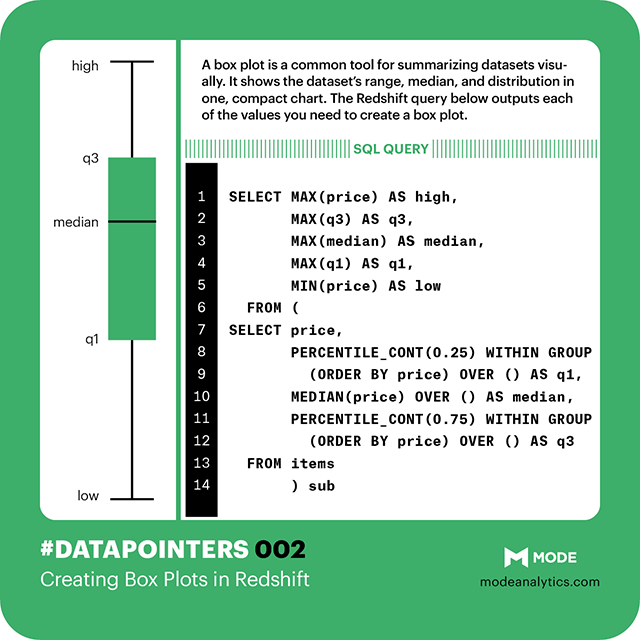
Redshift offers a couple useful functions that make calculating medians and quartiles easier. As you'll see below, two built-in functions eliminate the need for the second CTE ( details, explained in Step 1) and dramatically shorten Step 2.
The MEDIAN window function calculates—you guessed it—the median.
The PERCENTILE_CONT window function finds any specified percentiles, offering a quick way to calculate the first quartile (25th percentile) and third quartile (75th percentile).
Unfortunately, Redshift doesn't support ARRAY_AGG functions, so you can't use the method above to add outliers.
WITH raw_data AS (
    SELECT sport_name AS series,
           age AS value
      FROM benn.olympic_athletes
),

quartiles AS (
SELECT series,
       PERCENTILE_CONT(0.25) WITHIN GROUP
         (ORDER BY value) OVER (PARTITION BY series) AS q1,
       MEDIAN(value) OVER (PARTITION BY series) AS median,
       PERCENTILE_CONT(0.75) WITHIN GROUP
         (ORDER BY value) OVER (PARTITION BY series) AS q3
  FROM raw_data
)

SELECT series,
       MIN(value) AS minimum,
       AVG(q1) AS q1,
       AVG(median) AS median,
       AVG(q3) AS q3,
       MAX(value) AS maximum
  FROM quartiles
 GROUP BY 1
Bonus 3: A visualization!
If you want to visualize your query results as an actual box plot, you can copy the visualization code from the embedded example.
Create a report in Mode that returns the same columns as above. series, minimum, q1, median, q3, and maximum are required, lower_outliers and upper_outliers are optional.
Replace your report's HTML (when editing your report, click “Report” and open the HTML pane) with this report's HTML. Voilà!
Bonus 4: A cheat sheet!
Like last week, we've compiled the key syntax for calculating box plot values in Redshift into one bite-size image.

Get our weekly data newsletter
Work-related distractions for data enthusiasts.


