Python's powerful data analysis capabilities are loved the world over. When it comes time to share findings with your team, taking a few extra steps to prep your analysis for consumption can go a long way towards landing your recommendation. Here are four straightforward guides to get you started with some of the most common and useful functions to make analysis presentation-ready:
Dataframe Styling in pandas
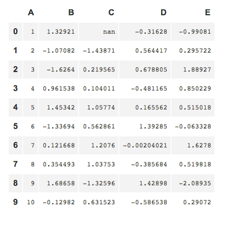
As Python has grown, so has one of its most popular libraries, pandas. Use its powerful tools to structure and manipulate numerical tables and time series data. The out-of-the-box appearance of a table is rarely pretty, and the key data points may not be obvious. Simple things like conditional formatting and color coding negative values can go a long way. When you've got great insights to share from pandas, you can make it easier for your audience to digest with dataframe styling.
Before
After
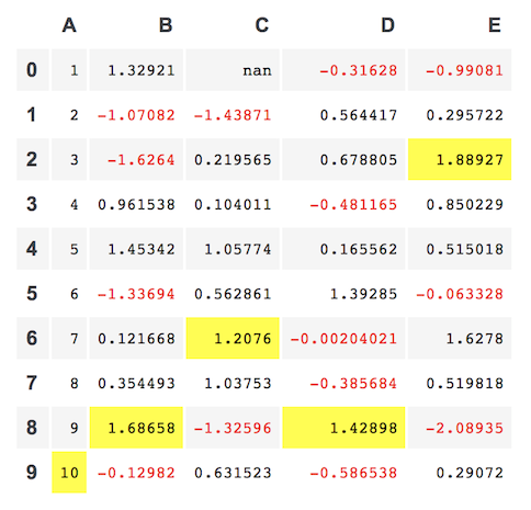
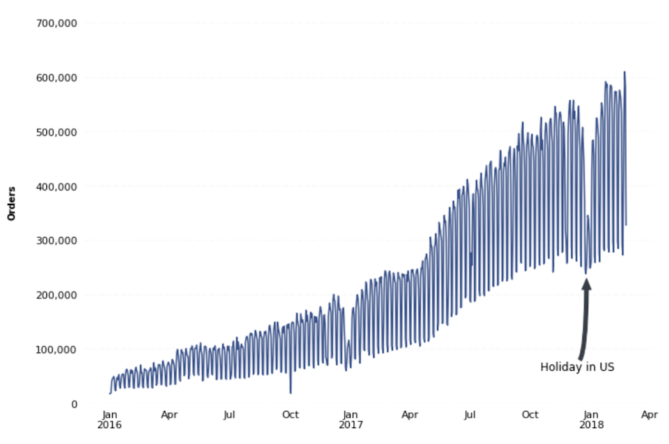
Chart Annotations
As nice as it would be if charts could speak for themselves, sometimes you just need to add some context. Help your audience understand how a chart was made, the data that informs it, or any other details you think are relevant with chart annotations.
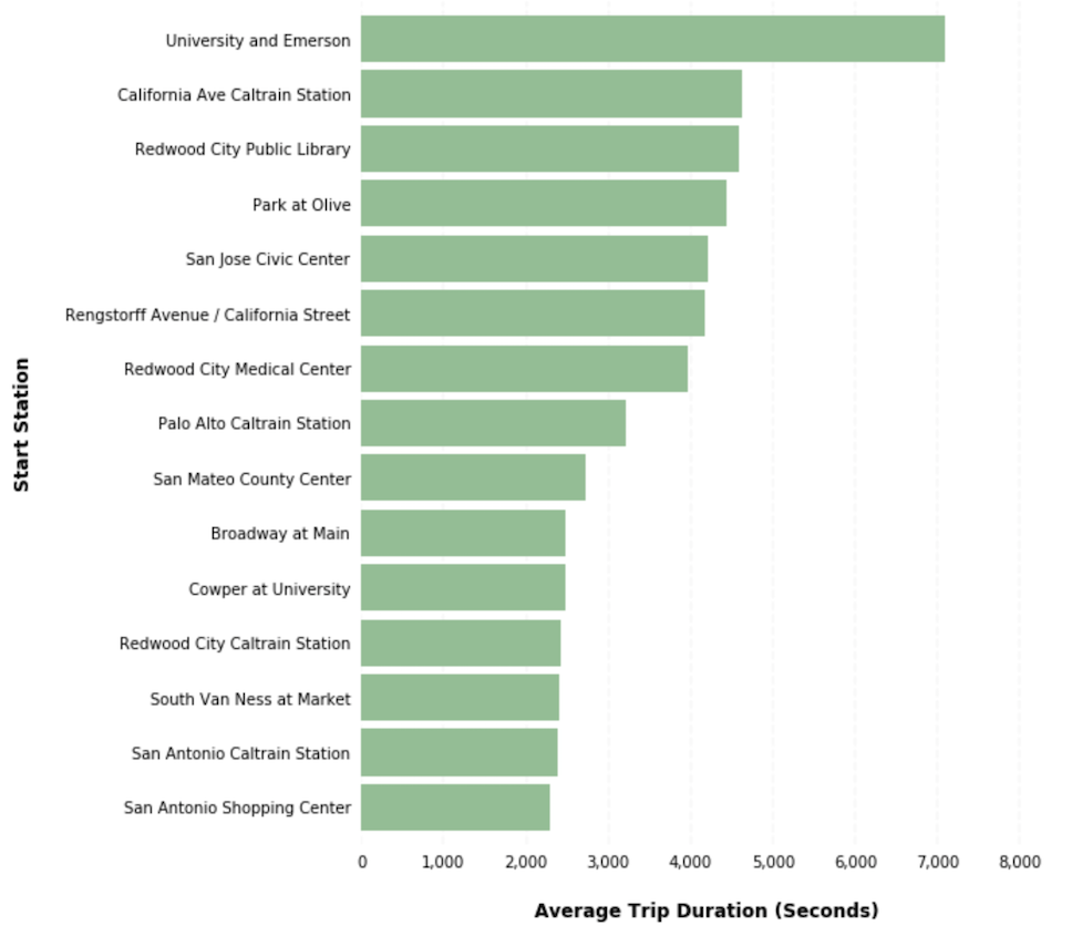
Horizontal Bar Charts
When your analysis includes categorical data (rather than sequential data), a vertical bar chart can sometimes be confusing. When dealing with categorical data, or if your bar chart labels just include more text than can be shown easily on the x-axis, try using horizontal bar charts.

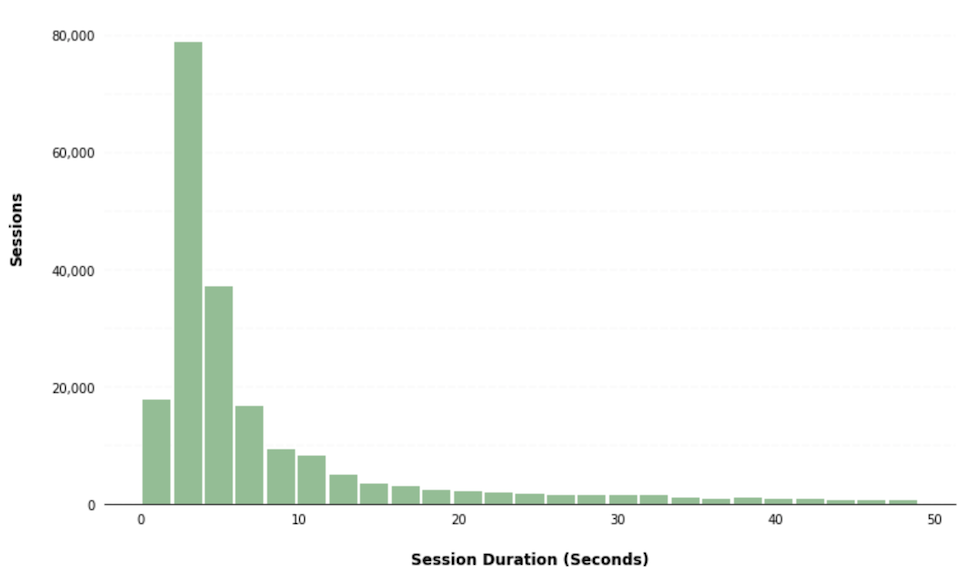
Histograms
Sometimes you need to convey the distribution of continuous numerical data. A quick and easy way to do so is to divide the values within a numerical variable into “bins”, and count the number of observations that fall into each bin. This type of chart is called a histogram.
To make your analysis even more visually appealing, read our suggestions for using a palette that follows your brand colors. Just remember, you don't need to create the Mona Lisa of data visualizations for your audience to understand your analysis. These functions are like spice in a dish; a little goes a long way.


