Product page | Quick start guide (login required) | Help center | Visual Explorer Field Guides
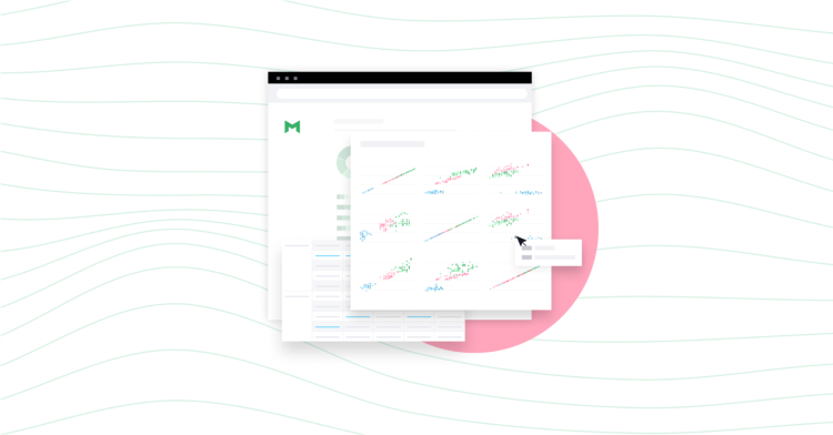
With Visual Explorer, analysts can create insights that tell more visually compelling stories to help stakeholders better understand their data.
Analysts frequently need to prepare charts for stakeholders who make important business decisions.
To help make information easier to understand, Visual Explorer borrows the "Layers" concept from the Grammar of Graphics framework. This gives analysts more flexibility in how they visualize critical insights for decision makers.
Mode's implementation provides analysts the tools they need to build charts that convey information more clearly by modifying size, colors, and labels.
Visual Explorer: Use Layers to express insights more dynamically
Layers allow you to modify specific chart elements (or each layer) to build more descriptive visuals. Here are the ways you can now customize layers in your visualization:
- Color layer - Modify the color of chart elements individually or by
using a template theme.
Changing colors strategically helps drive home important insights. For example, with Visual Explorer, users can highlight a particular bar in their chart with their company color and make all other bars gray. Additionally, people who build charts will have the ability to match their newly created visuals to a brand.
By controlling colors, users can make charts easier to understand for downstream stakeholders who only care about the final answer.
- Size layer - Dynamically adjust the size of a chart element by connecting it to your data. You can now drag a measure to size to showcase
the depth of that quantity and how it affects the dimensions already being visualized in your visual explorer chart.
- Text layer - Add a label to chart elements. This is particularly
helpful when you want numbers to show above bars on a bar chart, for example.
- Details - Add notes to the UI hover state that will give more context to your charts. This helps downstream stakeholders better understand
what’s going on when viewing a chart element.
To learn more about how you can control chart elements to make them easier to read, schedule a demo.
Visual Explorer Resources
Product page | Quick start guide (login required) | Help center | Visual Explorer Field Guides


