Over the last few months, we've been heads down building new power into Mode to help everyone explore data.
Earlier this summer we released report filters and the new charts. Analysts are using these new features to turn what were previously static reports into powerful tools for anyone to answer routine questions.
As analysts have started using report filters and the charts, we've heard a lot about how the features further streamline their SQL-powered workflow. There's also been a lot of requests for even more power.
We've been working closely with a group of customers to prioritize these requests. What provides the biggest timesavers for analysts? What will help less-technical folks answer routine questions on their own? How can everyone collaborate even more?
Behind the new charts, is a completely new framework capable of opening up limitless data exploration. We're laser-focused on using its new power to deliver quickly on the answers to these questions. There's a lot—drilldowns included—on the way.
The newest chart builder feature is officially live: Visualization filters.
Visualization filters let analysts and report viewers explore data sets visually to share ideas and spark conversation. Here's how they work.
How visualization filters work
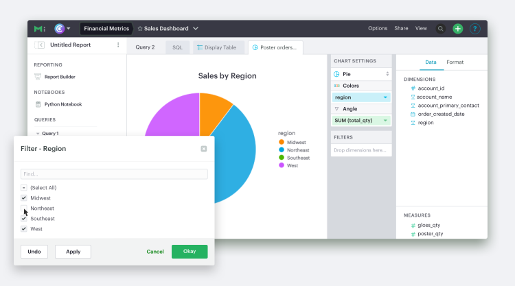
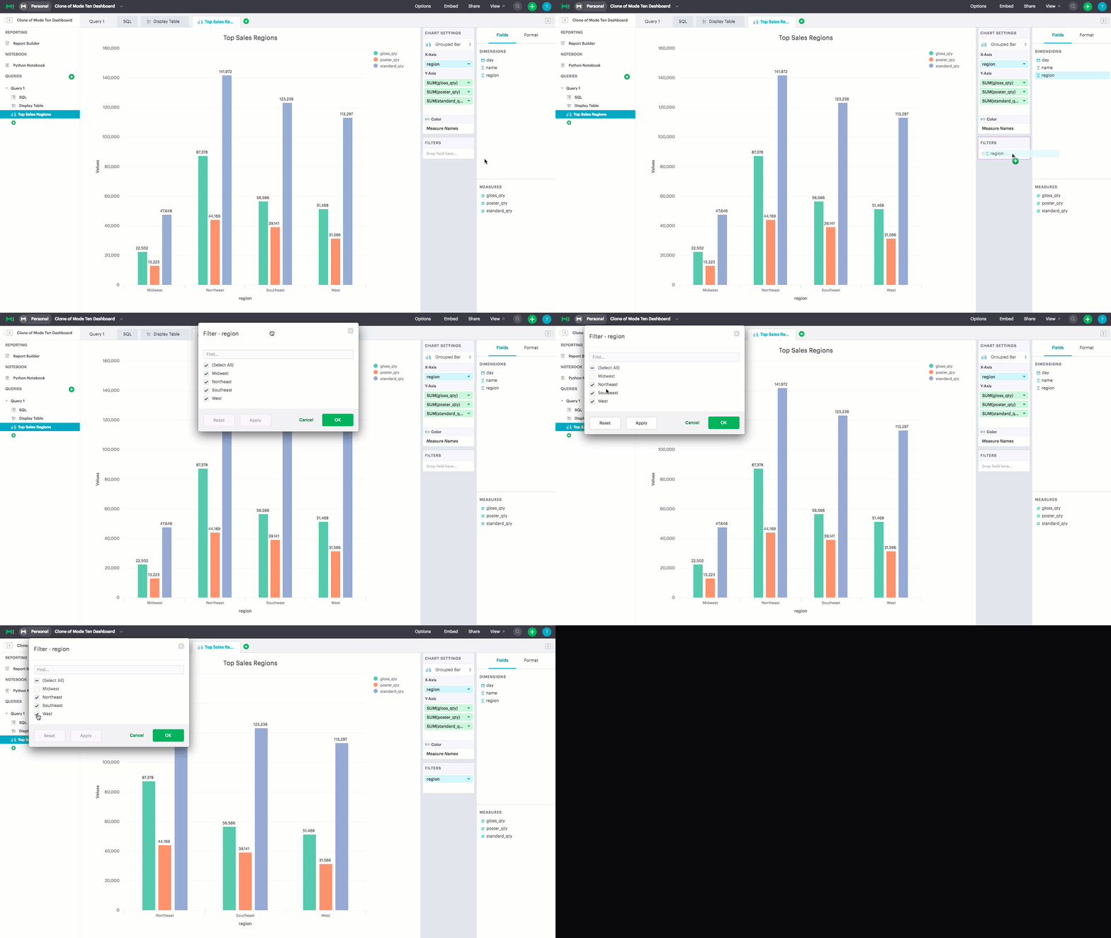
When you open the chart builder, you'll find a new drop zone called “Filters.” As with other drop zones, drag and drop a dimension or measure into the Filters drop zone. Add as many fields as you like.
After adding a field to the drop zone, a modal will appear with filtering options. Modify your filter options and click Apply to watch the changes as you go. Pro-tip: You can move this modal around.
You'll notice that charts are taller, too. We're taking advantage of your screen's real estate to provide more space for exploring while creating charts, or exploring in the expanded view.
Exploration, right in the dashboard
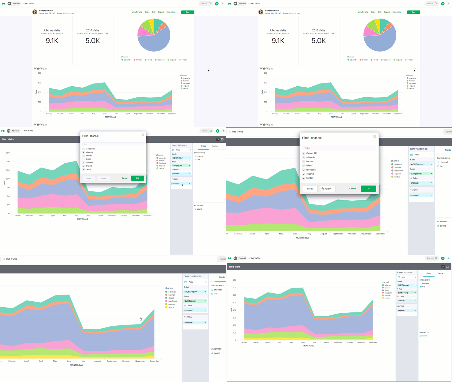
These exploratory tools are also available for report viewers. When writing your query, consider pulling a flatter data set with potentially relevant data for follow on questions. Then use the filters to present the specific answer at hand. When you deliver the results via email, Slack, or URL, let the recipient know there's more data to explore—all they'll need to do is open the expanded view and modify the filters themselves. Note: report view exploration tools are available on the Plus Plan.
Dive Deeper
Head over to the help site for Visualization Filter documentation, or jump right in to try them out.
As with all of our releases, we absolutely love your feedback and questions. Email us at hi@modeanalytics.com or start a chat in the product to talk with our team.
Stay tuned—later this week we're flipping on another feature!
