9 Useful R Data Visualization Packages for Data Visualization

Asha Hill, Customer Success Analyst
December 1, 2021
NaN minute read
Oct. 22 update: R has been upgraded to version 4.2.0 and popular R libraries have been updated in Mode’s notebook
If you've visited the CRAN repository of R packages lately, you might have noticed that the number of available packages has now topped a dizzying 18,000+. This means there are packages for practically any data visualization task you can imagine, from visualizing cancer genomes to graphing the action of a book.
For new R coders, or anyone looking to hone their R data viz chops, CRAN's repository may seem like an embarrassment of riches—there are so many data viz packages out there, it's hard to know where to start.
To provide one path through the labyrinth, we’re giving an overview of 9 useful interdisciplinary R data visualization packages. Mode R Notebooks support three libraries on this list - ggplot2, Lattice, and Plotly - and more than 60 others that you can explore on our Notebook support page.
Learn more

Get a deeper dive of Mode's Visualizations
Learn how Mode's visualizations can help you tell stronger stories with your data.
ggplot2

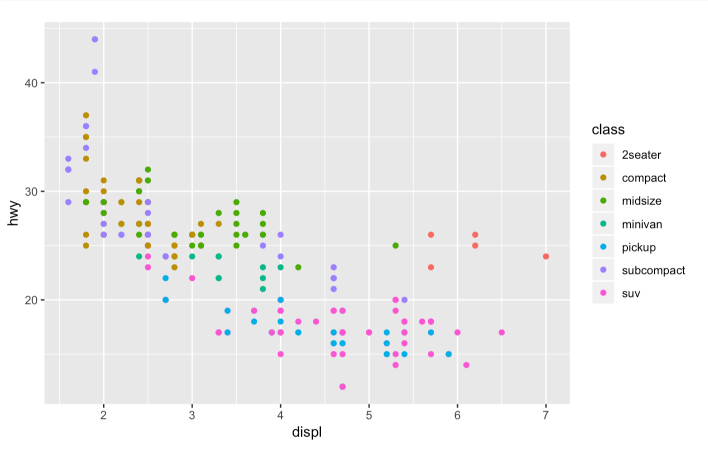
Scatterplot (Hadley Wickham/Tidyverse)
While it's relatively easy to create standard plots in R, if you need to make a custom plot, things can get hairy fast. That's why ggplot2 was born: to make building custom plots easier.
In the words of its creator, ggplot2 “takes care of many of the fiddly details that make plotting a hassle (like drawing legends) as well as providing a powerful model of graphics that makes it easy to produce complex multi-layered graphics.”
ggplot2 is based on The Grammar of Graphics, a system for understanding graphics as composed of various layers that together create a complete plot. With ggplot2, you can, for instance, start building your plot with axes, then add points, then a line, a confidence interval, and so on.
The drawback of ggplot2 is that it may be slower than base R, and new programmers may find the learning curve to be a bit steep. But fans argue that learning to master ggplot2 and (more generally) the tidyverse way of handling data pays huge dividends for any data scientist working in R.
Created by: Hadley Wickham, available in Mode Where to learn more: ggplot2
Lattice
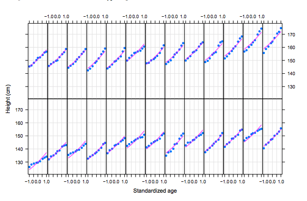
Fitted models in panel functions (Deepayan Sarkar)
When you need to visualize multi-variate data, Lattice is your friend. Lattice is a system of plotting inspired by Trellis graphics. It helps you create tiled panels of plots to compare different values or subgroups of a given variable. (These tiled plots often end up looking like a garden trellis, as you can see above.)
Lattice was built using the grid package for its underlying implementation and it inherited a lot of grid's features. Since grid has subsequently been folded into base R, the logic of Lattice should feel familiar to many base R users.
For a deep dive into the differences between using ggplot2 and Lattice, check out this 12-part series over at Learn R.
Created by: Deepayan Sarkar, available in Mode Where to learn more: Lattice
highcharter
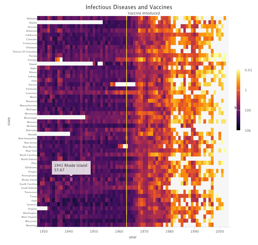
Interactive choropleth map (Joshua Kunst)
Highcharter is an R wrapper for Highcharts, an interactive visualization library in JavaScript. Like its predecessor, highcharter features a powerful API.
Highcharter makes dynamic charting easy. It uses a single function, hchart(), to draw plots for all kinds of R object classes, from data frame to dendrogram to phylo. It also gives R coders a handy way to access the other popular Highcharts plot types, Highstock (for financial charting) and Highmaps (for schematic maps in web-based projects).
The package has easy-to-customize themes, along with built-in themes like “economist,” “financial times,” and “538,” in case you want to borrow a look for your chart from the pros.
Created by: Joshua Kunst Where to learn more: highcharter
Leaflet

GeoJSON map (RStudio)
Like highcharter, Leaflet for R is another charting package based on a hugely-popular JavaScript library of the same name.
Leaflet offers a lightweight but powerful way to build interactive maps, which you've probably seen in action (in their JS form) on sites ranging from The New York Times and The Washington Post to GitHub and GIS specialists like Mapbox and CartoDB.
The R interface for Leaflet was developed using the htmlwidgets framework, which makes it easy to control and integrate Leaflet maps right in R Markdown documents (v2), RStudio, or Shiny apps.
Created by: Joe Cheng, Bhaskar Karambelkar, Yihui Xie Where to learn more: Leaflet for R
RColorBrewer
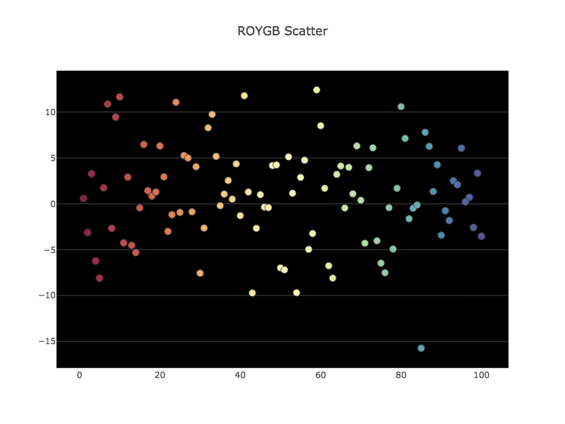
Diverging Color Scales (Plotly)
RColorBrewer makes it easy to take advantage of one of R's great strengths: manipulating colors in plots, graphs, and maps.
The package is based on Cynthia Brewer’s work on the use of color in cartography (check out Colorbrewer to learn more), and it lets you create nice-looking sequential, diverging, or qualitative color palettes. It also plays nicely with Plotly.
Created by: Erich Neuwirth Where to learn more: RColorBrewer
Plotly
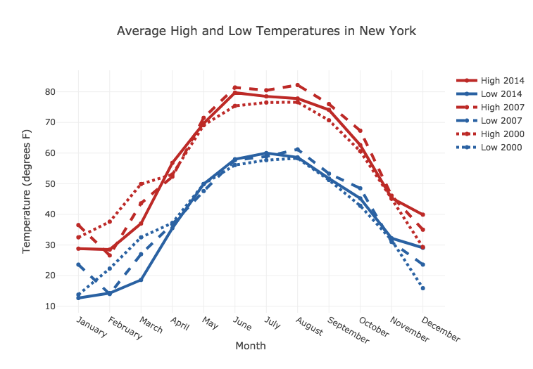
Line plot (Plotly)
You might know Plotly as an online platform for data visualization, but did you also know you can access its capabilities from an R or Python Notebook?
Like highcharter, Plotly’s forte is making interactive plots, but it offers some charts you won’t find in most packages, like contour plots, candlestick charts, and 3D charts.
Created by: Plotly, available in Mode Where to learn more: Plotly
sunburstR
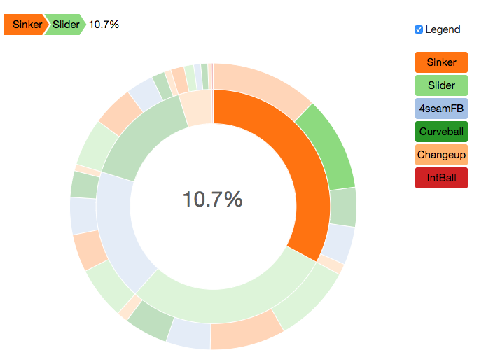
Football visualization with SunburstR (Mike Bostock)
Sunburst charts are great for visualizing data that describes sequences of events, from sports data to user flows through a product.
With SunburstR, you can build R charts just like the sunburst sequence visualizations created by Kerry Rodden in d3.js. The diagrams are interactive, giving viewers a powerful way to explore sequence data on their own.
Created by: Kent Russell, Kerry Rodden, Mike Bostock, and Kevin Warne Where to learn more: sunburstR
RGL
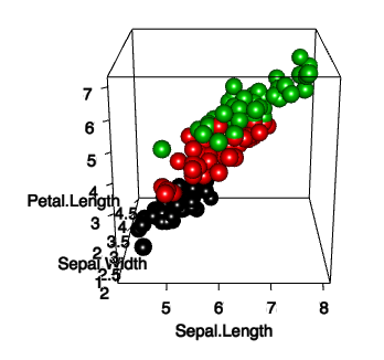
3D plot of iris data in RGL (Duncan Murdoch)
To create interactive 3D plots in R, check out RGL. Its logic is loosely modeled after base R graphics, but in three dimensions rather than two. Like Lattice, it's inspired by the grid package (though it's not technically compatible with it), so its methods should feel familiar to seasoned R coders.
RGL has lots of cool bells and whistles, including a variety of 3D shapes to choose from, lighting effects, various “materials” for the objects, and even the ability to make an animation of your 3D scene.
Created by: Daniel Adler and Duncan Murdoch Where to learn more: rgl
dygraphs
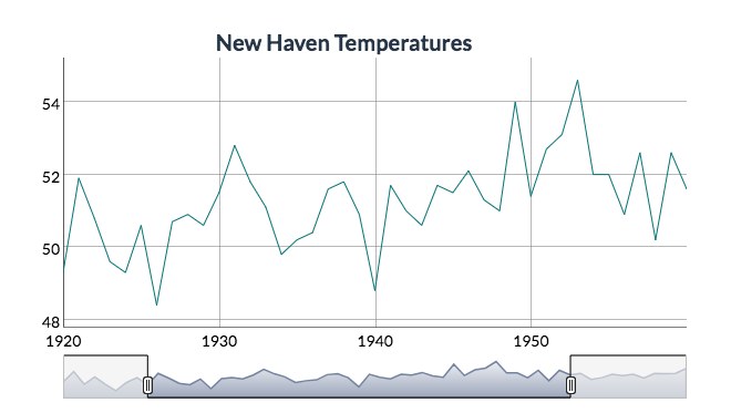
Time series chart with range selector (RStudio)
This package provides an R interface for dygraphs, a fast, flexible JavaScript charting library for exploring time-series data sets. What's powerful about dygraphs is that it's interactive right out of the box, with default mouse-over labels, zooming, and panning. It's got lots of other nifty interactivity features, like synchronization or the range selector shown above.
But dygraph's interactivity doesn't come at the expense of speed: it can handle huge datasets with millions of points without slowing its roll. And you can use RColorBrewer with dygraphs to choose a different color palette for your time series— check out this example to see how.
Created by: Dan Vanderkam and RStudio Where to learn more: dygraphs for R
Now that you've taken our tour of 9 useful R data viz packages, you probably want to learn about some useless but fun R packages. Check out Ista Zahn's short list of 'Useless but Fun R Packages' here, and enjoy watching what the cow says, or having R tell your fortune.
If we've missed any of your favorite R data viz libraries in this short list, let us know! Tweet at us @ModeAnalytics.
Oct. 22 update: R has been upgraded to version 4.2.0 and popular R libraries have been updated in Mode’s notebook
Get our weekly data newsletter
Work-related distractions for data enthusiasts.
