This article was updated in Dec. 2021.
Sometimes the median and mean aren't enough to understand a dataset. Are most of the values clustered around the median? Or are they clustered around the minimum and the maximum with nothing in the middle? When you have questions like these, distribution plots are your friends.
The box plot is an old standby for visualizing basic distributions. It's convenient for comparing summary statistics (such as range and quartiles), but it doesn't let you see variations in the data. For multimodal distributions (those with multiple peaks) this can be particularly limiting.
But fret not—this is where the violin plot comes in.
- What is a violin plot
- How to read a violin plot
- Examples of Violin Plots
- Tools for making violin plots
What is a violin plot?
A violin plot is a hybrid of a box plot and a kernel density plot, which shows peaks in the data. It is used to visualize the distribution of numerical data. Unlike a box plot that can only show summary statistics, violin plots depict summary statistics and the density of each variable.
How to read a violin plot
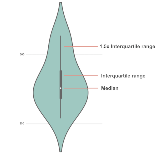 Violin plots have many of the same summary statistics as box plots:
- the white dot represents the median
- the thick gray bar in the center represents the interquartile range
- the thin gray line represents the rest of the distribution, except for points that are determined to be “outliers” using a method that is a function of the interquartile range.
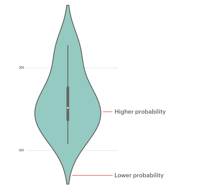
On each side of the gray line is a kernel density estimation to show the distribution shape of the data. Wider sections of the violin plot represent a higher probability that members of the population will take on the given value; the skinnier sections represent a lower probability.
Enough of the theoretical. Let's look at some examples. We'll be using Seaborn, a Python library purpose-built for making statistical visualizations.
Examples of Violin Plots
About the data
The table modeanalytics.chick_weights contains records of 71 six-week-old baby chickens (aka chicks) and includes observations on their particular feed type, sex, and weight.
Basic violin plot
Click here to see the complete Python notebook generating this plot.
This violin plot shows the relationship of feed type to chick weight. The box plot elements show the median weight for horsebean-fed chicks is lower than for other feed types. The shape of the distribution (extremely skinny on each end and wide in the middle) indicates the weights of sunflower-fed chicks are highly concentrated around the median.
Horizontal violin plot with observations
Click here to see the complete Python notebook generating this plot.
Like horizontal bar charts, horizontal violin plots are ideal for dealing with many categories. Swapping axes gives the category labels more room to breathe.
You can remove the traditional box plot elements and plot each observation as a point. Points come in handy when your dataset includes observations for an entire population (rather than a select sample). When you have the whole population at your disposal, you don't need to draw inferences for an unobserved population; you can assess what's in front of you.
Reducing the kernel bandwidth generates lumpier plots, which can aid in identifying minor clusters, such as the tail of casein-fed chicks.
Grouped violin plot
Violin plots can also illustrate a second-order categorical variable. You can create groups within each category. For instance, you can make a plot that distinguishes between male and female chicks within each feed type group.
Click here to see the complete Python notebook generating this plot.
The grouped violin plot shows female chicks tend to weigh less than males in each feed type category. Further, you can draw conclusions about how the sex delta varies across categories: the median weight difference is more pronounced for linseed-fed chicks than soybean-fed chicks.
Grouped violin plot with split violins
Instead of drawing separate plots for each group within a category, you can instead create split violins and replace the box plot with dashed lines representing the quartiles for each group.
Click here to see the complete Python notebook generating this plot.
The split violins should help you compare the distributions of each group. For instance, you might notice that female sunflower-fed chicks have a long-tail distribution below the first quartile, whereas males have a long-tail above the third quartile.
Tools for making violin plots
Further reading on violin plots
- Box Plot vs Violin Plot in R (Cerebral Mastication)
- Violin plots are great (Eamon Caddigan)
- Violin Plot (Data Visualisation Catalogue)


