Usage data is like gold for software development teams. Software companies are constantly analyzing user behavior to create valuable insight for decision-making and feature development. But the data generated by users isn't only valuable to the company whose products are being used; it can be valuable to the users themselves.
If you're a B2B software provider, you almost certainly have access to data that can help your users do their jobs better, and that can frame your business in a positive light. One of the most effective ways to deliver that data is through an in-app stats page.
There's a lot to think about when you first start out with in-app analytics. Building the page doesn't have to be hard. But it does come with some important decisions about how to best frame usage of features while keeping things interesting and valuable for your users (and purchase decision makers).
A great way to get started with your own stats page is to look for inspiration in the work of other organizations. We've scoured the web for great examples of companies providing valuable usage data to their customers through in-app analytics.
Github
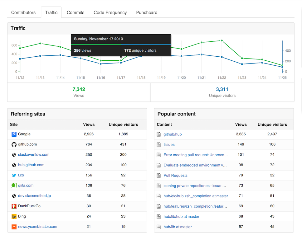
Github's software development platform shows repository owners a traffic analytics page, which displays which sites are referring the most traffic to their repositories and which elements within those repositories are the most popular. Repository owners can see the most valuable channels for their work, as well as understand which parts of their work are most impactful. And by including traffic from within Github among the sources for referral traffic, Github demonstrates how strong the network effects within in their own community can be.
Intercom
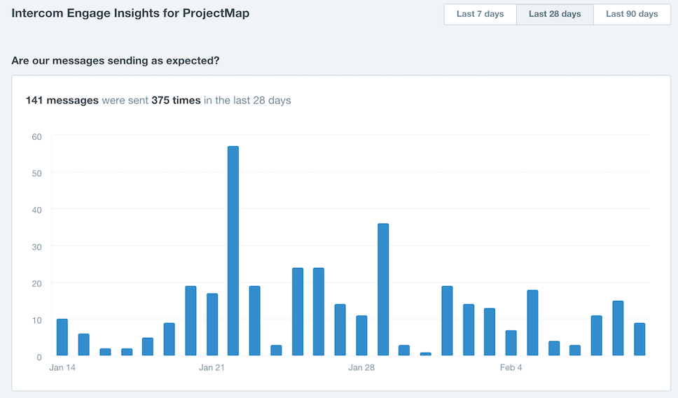
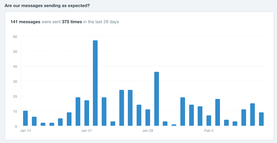
Intercom's in-app messaging platform comes with an analytics page to help Intercom's customers track and manage the range of messages they send. Among other metrics, this page points out the users that are receiving the most messages, which helps Intercom customers avoid overloading message recipients. It shows message open rates and response rates too, which helps their customers optimize the language in those messages to improve their effectiveness. The page also shows benchmark conversion rates for various types of messages sent on their platform. When customers see below-average performance, the presence of benchmarks may suggest it's more of a problem with the content of their messages than the platform that delivers them (in this case, Intercom).
Algolia
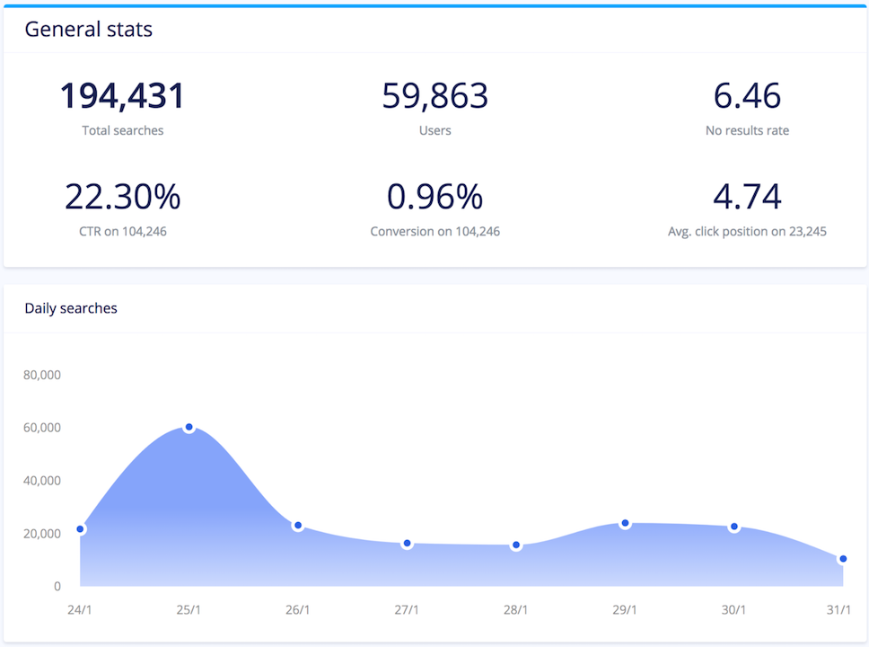
Algolia's site search software includes an analytics page for user search activity. In addition to the metrics you'd expect to see, like total searches and total users interacting with search, Algolia also shows popular searches, rate of searches that return no result, and the average click-through-rate of searches. These metrics can help Algolia's customers discover which topics are most important to their users, and how effectively their search results are delivering information that their users need. And by highlighting the highest-number usage metrics like total searches and total users, Algolia's analytics page reminds customers how much value they're getting from search.
ChargeBee
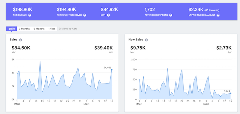
ChargeBee's subscription billing service comes with an analytics page that displays metrics like revenue totals, transaction totals, and number of active subscriptions. But ChargeBee goes a step further and provides a Committed Monthly Recurring Revenue metric, which alleviates much of the complex work that subscription-based businesses typically have to do to figure out their recurring revenue. ChargeBee's CMRR helps customers account for future subscription upgrades, downgrades, cancellations and activations, making the accounting and forecasting process much easier on their customers. ChargeBee's emphasis on metrics that their software helps handle, like active subscriptions and MRR, is a classic example of positive framing.
Xero
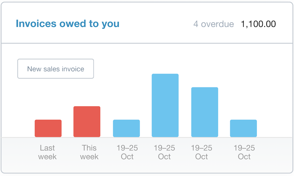
Xero creates accounting software that lets companies manage their finances in the cloud. Their analytics page is full of useful information to help their customers keep track of the money flowing through their business. One of the charts included shows invoices a company is owed by date, which can help customers plan bandwidth on their account team to manage renewals. Xero also puts the total cashflow being managed in their software front and center, an important metric to their customers and a great way to show how central Xero is to their business.
Zoom
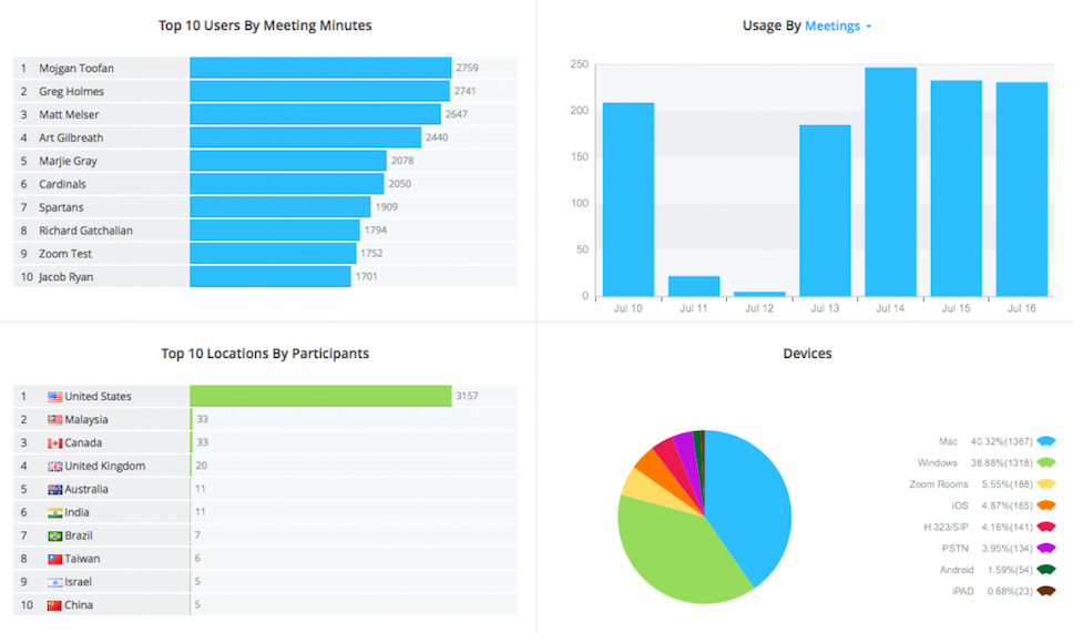
Zoom's videoconferencing software comes with an analytics page that helps customers learn more about the way they communicate and the people they're conferencing with. The Zoom analytics page can show top geographic locations by users and top devices by users, data that can help Zoom customers tailor future conferences to their audience. Zoom's dashboard provides lots of detail on total usage, including the Zoom power users in an organization, those that host conferences the most.
HighFive
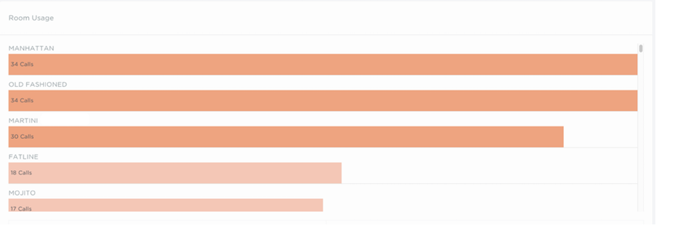
Highfive's videoconferencing hardware and software comes with an analytics page that visualizes usage of the Highfive system. A calendar heatmap shows which days have the highest density of calls, which can help customers learn when their employees are experiencing heavy days of meetings and calls. Highfive's dashboard also displays which rooms get used the most, showing customers where they're getting the most bang for their buck.
Docsend
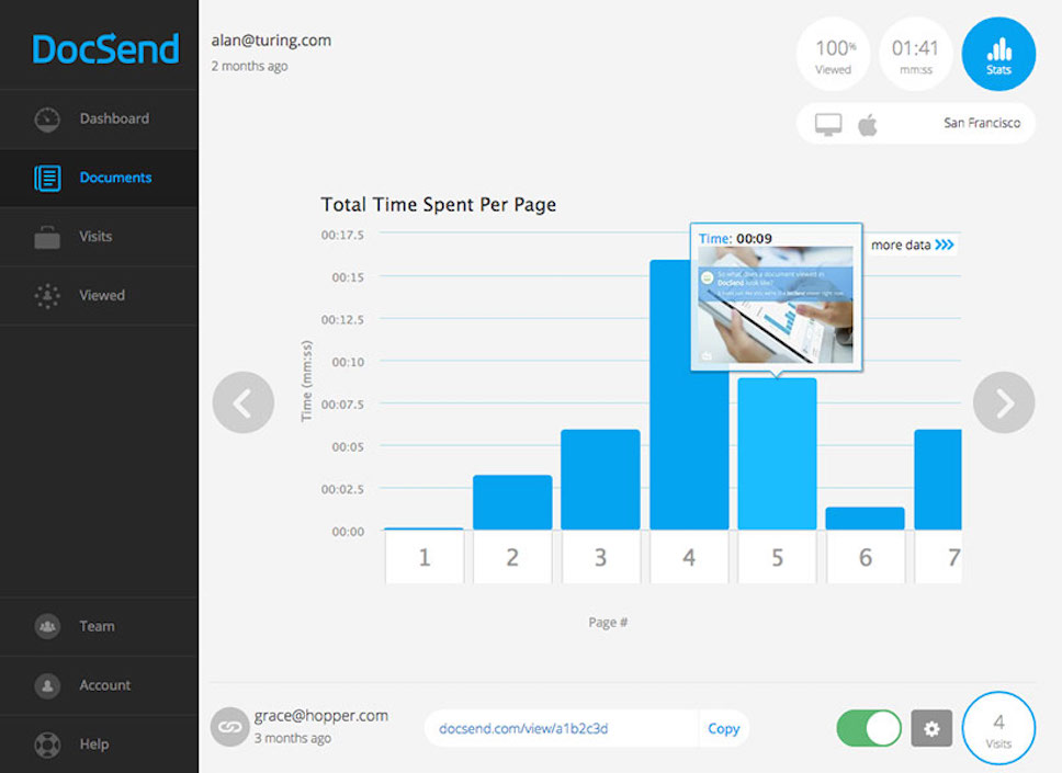
DocSend helps teams keep track of documents and collect leads from sales assets. Their analytics page shows customers how content is being used, and by whom. Customers of Docsend can see which assets are used most by their team, and viewed most by external audiences. Docsend also shows when views spike for an asset. This data can help organizations figure out which content is most effective, which is underutilized and may need updating, and when their audience is most likely to consume their content.
All of these pages deliver valuable data to their users while creating value for the businesses that created them. And this kind of meta-feature is not hard to create; you can read our post about how we created our own with a tiny team in less than two weeks.


