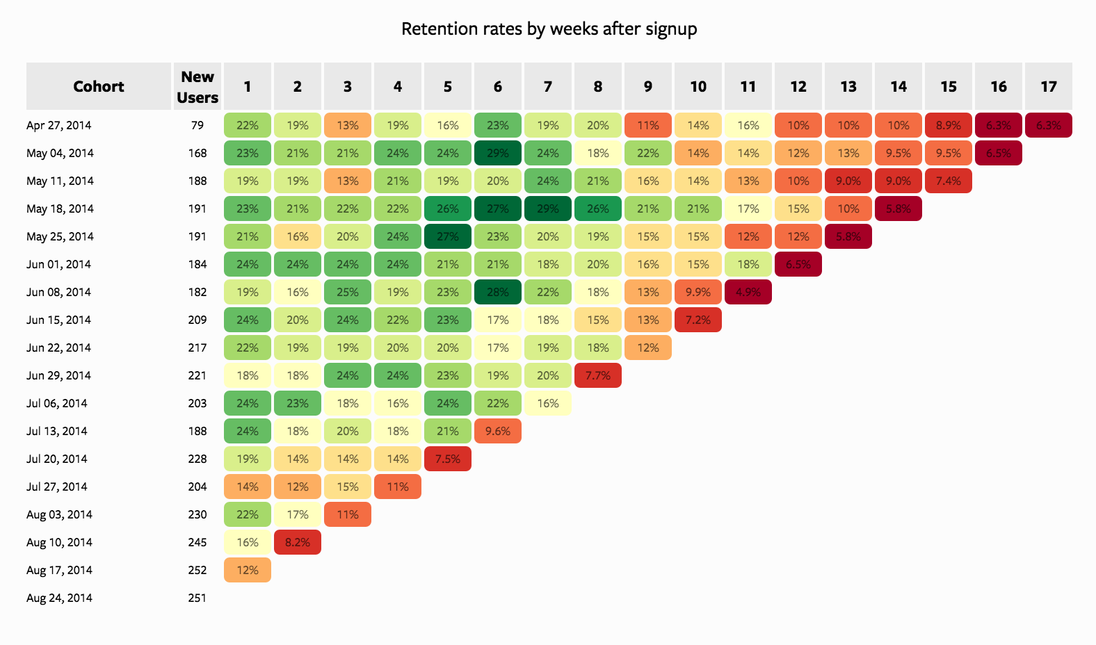
For people who analyze customer behavior, the table above is a familiar one. This Mixpanel chart measures retention rates across different user cohorts. By moving down the table, you can see how retention is changing over time.
This report, which shows how sticky your product is over time, has become one of the most important measures of health for many companies. It's supported by a wide variety of tools, from out-of-the-box reporting tools like Google Analytics and KISSmetrics to data-collection services like Segment and Keen.io. Industry experts agree, this is the best tool for cohorting customers and measuring retention.
Though temporal cohorts like these are great for measuring what's happening, they have a major drawback: they don't tell you what to do next. If retention is improving, great! But what should we do next? (Do more? Do less?) More troublingly, if retention is falling, how do we fix it?
What To Do Next?
The trouble with this view is that it categorizes users in one, distinctly non-actionable way: by when a user signs up. Knowing that older users retain at a higher rate isn't terribly helpful because you can't get more users to sign up last month. Moreover, falling retention doesn't necessarily mean that you should revert back to an older version of your product or business. Even if that were technically and organizationally possible, retention could be dropping because a new feature's novelty has worn off, a competitor released big improvements, or other external forces have shifted against you.
But all isn't lost. To figure out what to do next—or what's going wrong—cohort your users in other ways.
Just as users who sign up last month are different from those who sign up today, users who sign up from your marketing page might be different from those who sign up after being invited. Similarly, some people might find your product through an ad while others might sign up after reading a blog post. Some might sign up from their phones, some from desktops, some from a Mac, some from Chrome, and some from Internet Explorer. Some folks probably enter their work email addresses, while others use an Outlook or Gmail account, and a few might provide .edu addresses. And some people might sign up from Brazil, while others from New York.
Like temporal cohorts, these cohorts probably have different retention rates. But unlike temporal cohorts, these cohorts tell you what to do next. If retention rates are high for people who sign up after reading blog posts but low for people who convert from ads, you can experiment with publishing more blog posts and spending less on advertising. This insight could also help explain an overall drop in temporal retention rates, if, for example, a greater percentage of your users are now coming from ads.
From Fixing Problems to Serendipitous Insights
This expanded cohort analysis can also help you learn about your users and proactively improve your product.
In some cases, the conclusions are simple. If retention rates are higher among users of a certain demographic, or who find your product via certain advertising channels, focus on acquiring users from those channels.
In other cases, the conclusions are more complex. Suppose you find that retention rates are higher for invited users compared to those who sign up on their own. This may be surprising—people who sign up organically are excited enough to find and sign up for a product on their own, so they should be better customers. But because invited users retain at a higher rate, social proof may be a powerful motivator for your users. It might be worth experimenting with ways to better connect your users with their friends.
Retention, Full Circle
By looking at retention rates across a variety of cohorts, you can uncover tons of insights and ideas that aren't obvious in the standard temporal cohorts. But temporal cohort analysis still serves a critical function: it shows whether the changes you've made—the things other cohorts told you to do next—are actually working.
So rather than discarding the traditional cohort analysis, use it as your benchmark. When looking for how you're doing, turn to temporal cohorts. When looking for what to do next, start segmenting.
How To Do It: Use Our Work
Answering open ended questions like “what do I do next?” almost always requires working with raw data. With access to information on users and what they do, creating these cohorts requires only a couple of SQL queries.
As a first step, it's often best to recreate the temporal view that's already familiar. The report below shows an example of how to create this using SQL. Click "Results à la Mode" on any of the charts to explore the query and data. Once there, you can click "Clone" to tailor the report to your own data.
By making a couple of small changes, this report can be adapted to show cohorts of all types. The first graph, which only requires changing one line of SQL, shows retention by user language. By changing that line once more and adding a few more, you show retention by signup device.
These reports are designed to work against any dataset that has a users table and events table. If you have these tables, you simply need to define them within your query; the rest of the code should work without any additional modifications.


